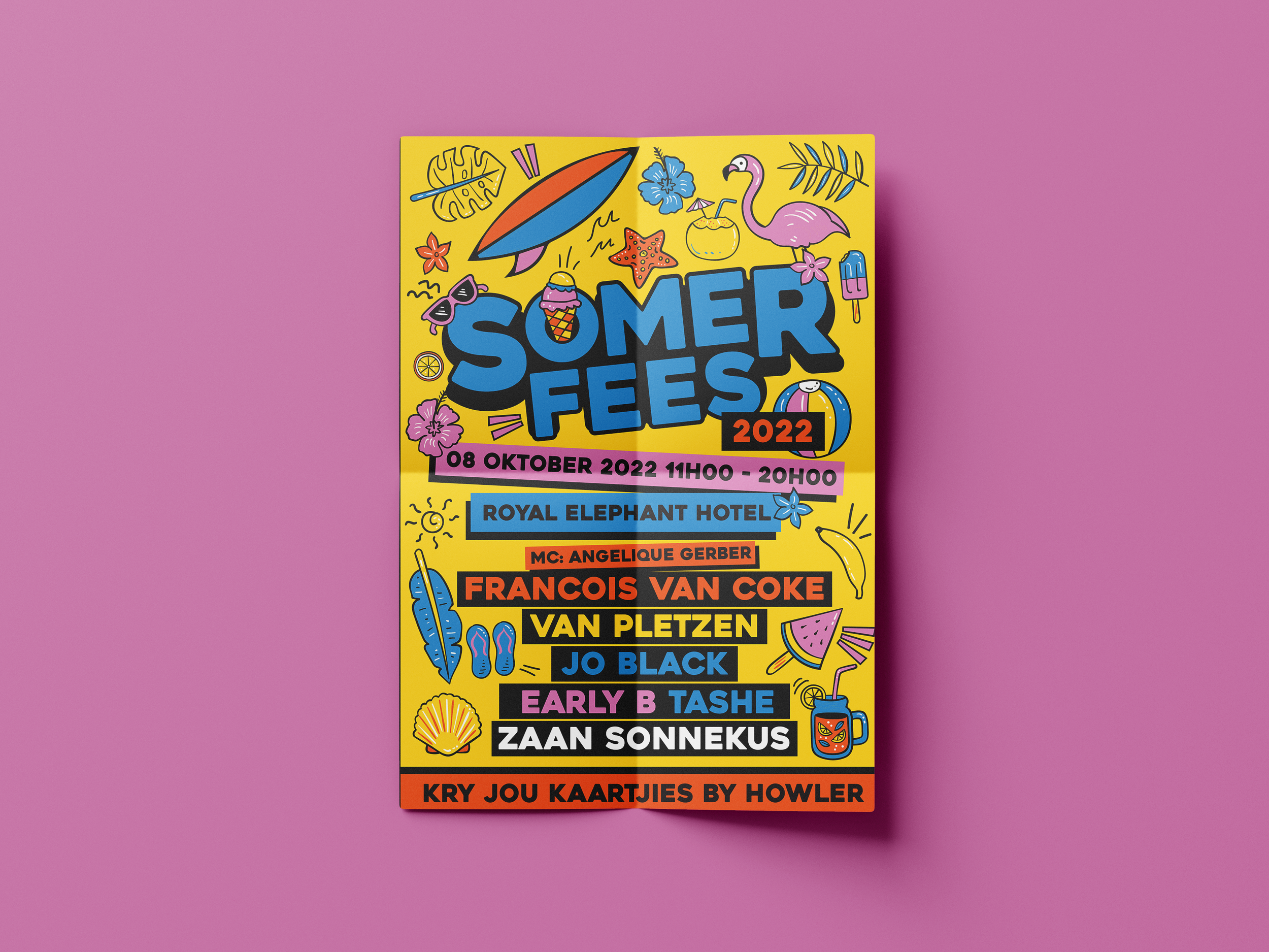
Somerfees
Somerfees isn’t just South Africa’s biggest Afrikaans music festival, it’s a bold celebration of culture, music, and community that captures the heartbeat of the country. Designing the identity for such an iconic event demanded more than decoration. It required building a visual language that could match the scale, energy, and pride of the festival itself.
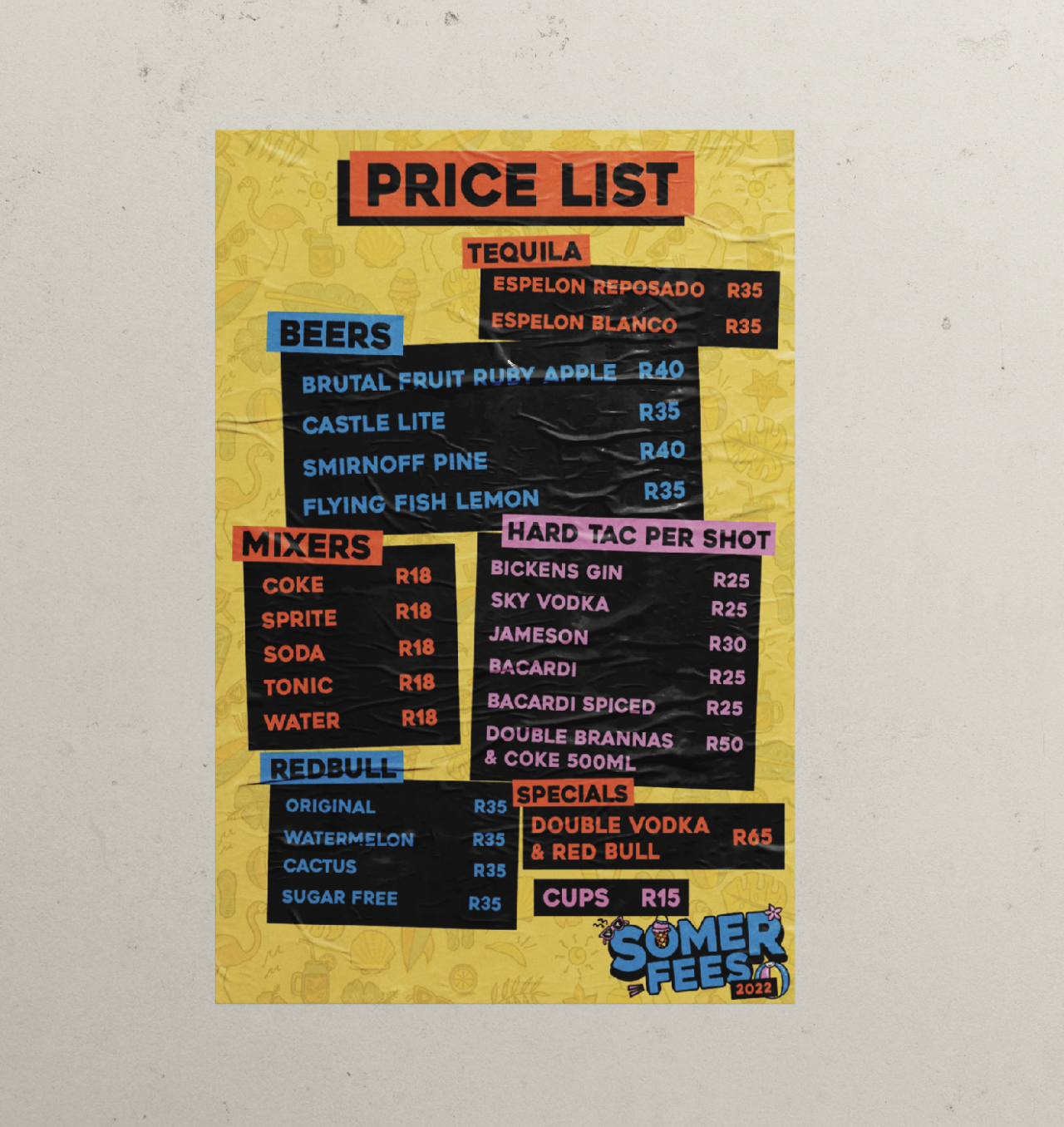
Every element of the identity was crafted from scratch. The logo, inspired by the movement of sound waves and the vibrancy of summer, was drawn to feel alive and dynamic. Custom icons were designed to reflect the festival’s cultural touchpoints, from music and dance to food and community, giving the system a distinct and memorable voice. Typography, patterns, and color palettes were all created to work seamlessly together, ensuring a bold, cohesive presence across posters, digital campaigns, merchandise, and wayfinding.
The result is an identity that is just as loud and unforgettable as the music that fills the air. Somerfees is more than a festival. It is a living symbol of Afrikaans culture reimagined through design. Built from the ground up, the visual system celebrates unity and tradition while pushing forward with modern energy, leaving festivalgoers with an experience that resonates long after the music fades.
Visual Identity Design • Brand Design • Festival Design • Videography
Adobe Photoshop • Adobe Illustrator • Premier Pro